The business world has gone mad for informational graphics. This is because, beyond breaking up a static block of text, visuals help distill complex information into something digestible. In other words—from science to politics to gossip—people love infographics.
So what makes a good infographic? Let’s start with a definition: an infographic is a picture that gives the reader the gist of a story. As such, the creation of a successful infographic begins with the development process. From the start, you need three things:
1) Data, preferably original or newly interpreted;
2) A specific goal; and
3) A narrative.
We joke around the Leff Communications office that “people love maps”—because, well, it’s true. Maps are easy to understand, they tie relevant information to known locations (don’t you always look for your hometown or state first?), and they present a simple entry point to even the most complex data. So our designer, Delilah Zak, took me through her process in creating an informational map.
We started by looking at this infographic, which uses data from last year’s Fortune 500 listing to promote Texas (click to see original PDF):
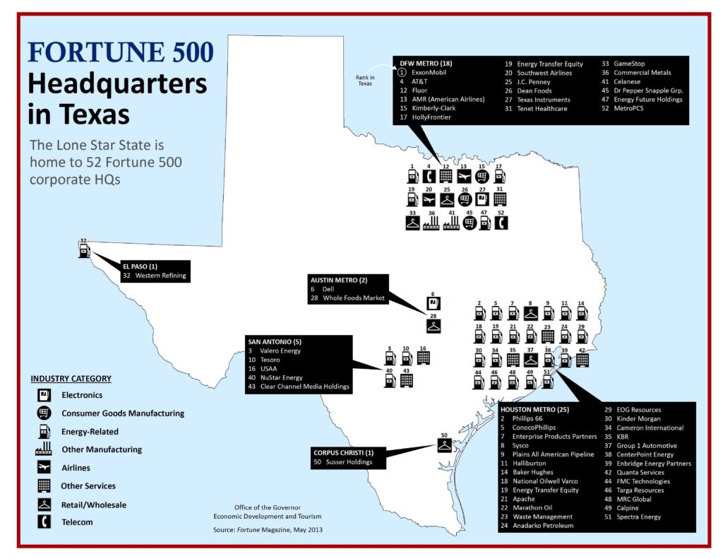
The infographic hits requirement #1—the data is from last year’s Fortune 500 list, a credible source—and #2—the infographic is posted on the state’s economic development website to promote Texas as a place to do business.* But it’s missing #3—that is, it gives information, but there’s not much fodder for conversation. Okay, so Texas is home to a number of Fortune 500 companies; they’re concentrated in Houston and Dallas; and they can be sorted into eight industry categories. So what? Moreover, the map legend does a poor job of conveying the information clearly and quickly; just how many of the companies are energy-related? You have to count the icons.
Delilah and I decided to recreate this map for the state of Illinois (the world headquarters of Leff Communications) with the goal of telling a story. Here’s what we came up with (click to enlarge):
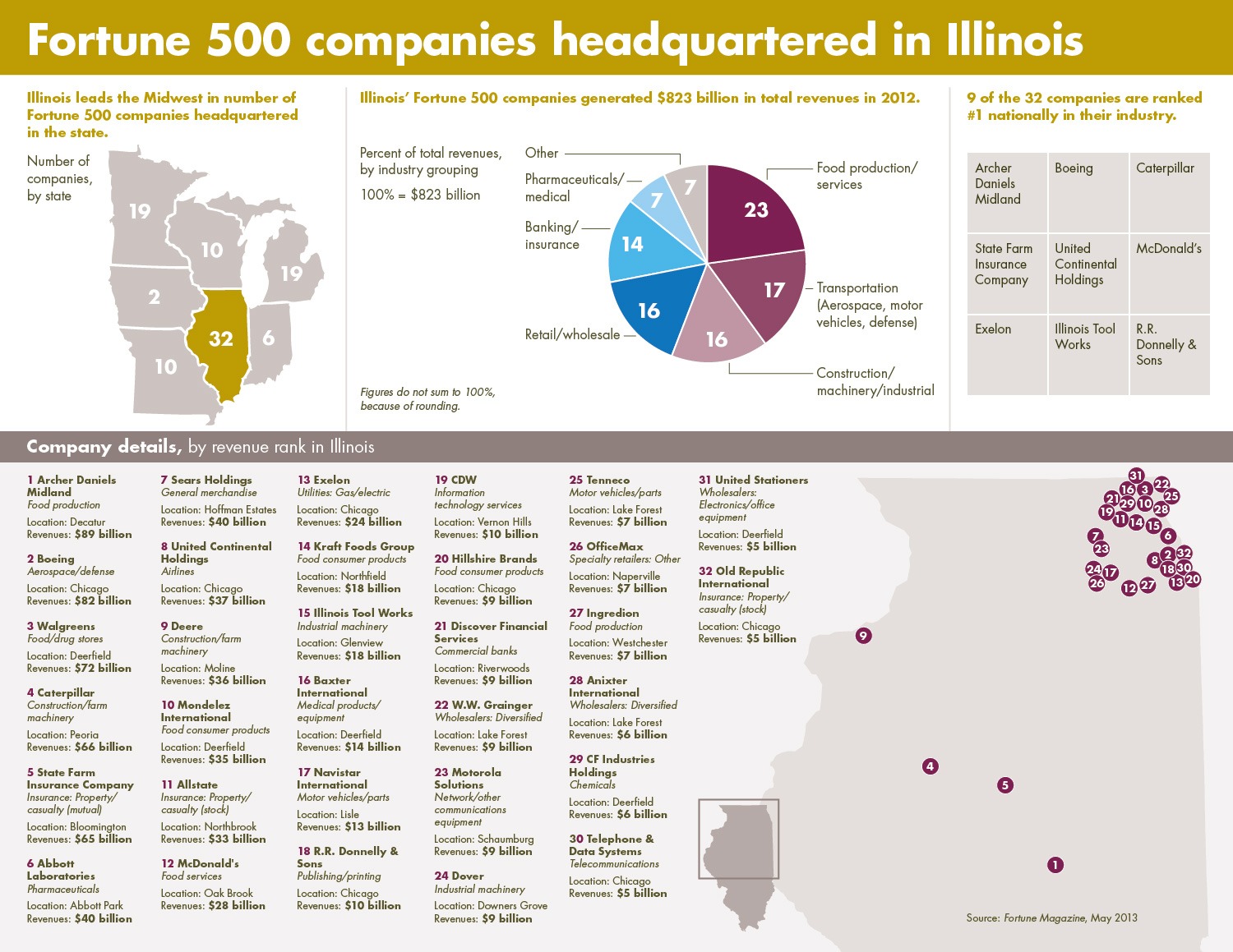
First, the similarities:
– We used the same data source.
– We show the state’s Fortune 500 companies, listed in order of their relative rank in the state.
– We list each company’s name and industry.
Now, the differences:
– The first thing to go, according to visualization expert Delilah, was that annoying industries legend. To satiate the curious reader, we provided much more detail on each company.
– For the map, Delilah plotted the actual locations of the companies instead of listing them as a block next to the major metro areas. This reveals at a glance that the Northeast region is a Fortune 500 powerhouse—but three of the top five companies are located in the central part of the state.
– Then the real fun began: to provide some context on how Illinois stacks up against its neighbors, we included a mini map of the Midwest—and Illinois is solid gold.
– Through a chart breaking down the companies’ revenues by industry grouping, we found that three industry groupings claim more than half the pie.
– To highlight the state’s industry leaders, we created a matrix showing the nine Illinois companies that are #1 nationally in their industry, listed by their relative rank in Illinois.
Of course, in the time it took you to read that list, you could have glanced through the infographic and gotten all the same information.
[pullquote]Beyond simply presenting a map of Illinois’ Fortune 500 companies, our infographic offers more of a story: Illinois’ preeminence in the region, our strongest industries, and the highest performers.[/pullquote]In the name of full disclosure, we did spend several hours creating the concept for our infographic. Delilah went through more than a few iterations; for example, when we realized how concentrated the companies are in the Northeast, Delilah scrapped the full state map she’d been working on and instead created an inset that stretches just far enough to include Decatur. In this way, the process involved making sure the form matched the function.
Delilah wanted me to mention that there are a lot of ways to tell this story; this is not necessarily the best ever. But beyond simply presenting a map of Illinois’ Fortune 500 companies, our infographic offers more of a story: Illinois’ preeminence in the region, our strongest industries, and the highest performers.
Oh yes, we just messed with Texas.
*Editor’s note: As of March 2015, Texas’ website has been redesigned and the offending infographic removed. In fact, the new website is much slicker, so credit where credit is due.
Leave a Reply
You must be logged in to post a comment.