
Because there are so many typography rules to follow, I thought I’d help you out and clue you in to some more. After all, I had to take four typography courses to get my design degree, so you might as well get two posts from us. Behold: the long-awaited follow-up to Delilah’s 2016 post “Five typography rules to design by.”
To demonstrate these rules, I’ve used one of the first commercial sans-serif typefaces: Futura. Designed in 1927 by German typographer Paul Renner, the Futura typeface was revolutionary for its use of simple geometric forms and rejection of conventional letter design. It’s been used consistently throughout the years, and you might recognize it from the covers of Field Notes notebooks; the cover of Lorde’s 2013 album, Pure Heroine; or from the lyric in “Holiday” by Vampire Weekend.
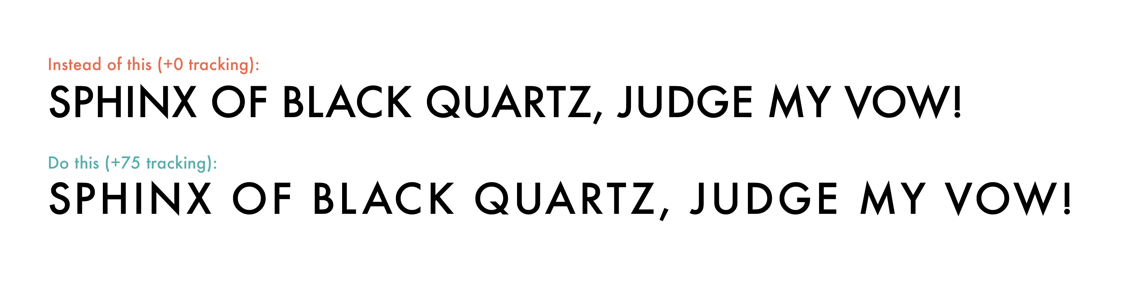
- Track all uppercase letters. The rhythm of words and sentence structure is less apparent when all letters are the same height, so tracking, or spacing out the letters, when using all caps can improve legibility.

- Never use a larger uppercase letter at the beginning of a phrase that is set in uppercase letters. It’s redundant, unnecessary, and ugly. Check out this Title vs. sentence case blog for other options, or just use all caps. (The “just use all caps” rule does not apply to work emails or social media unless you’re running Diane Keaton’s Instagram.)
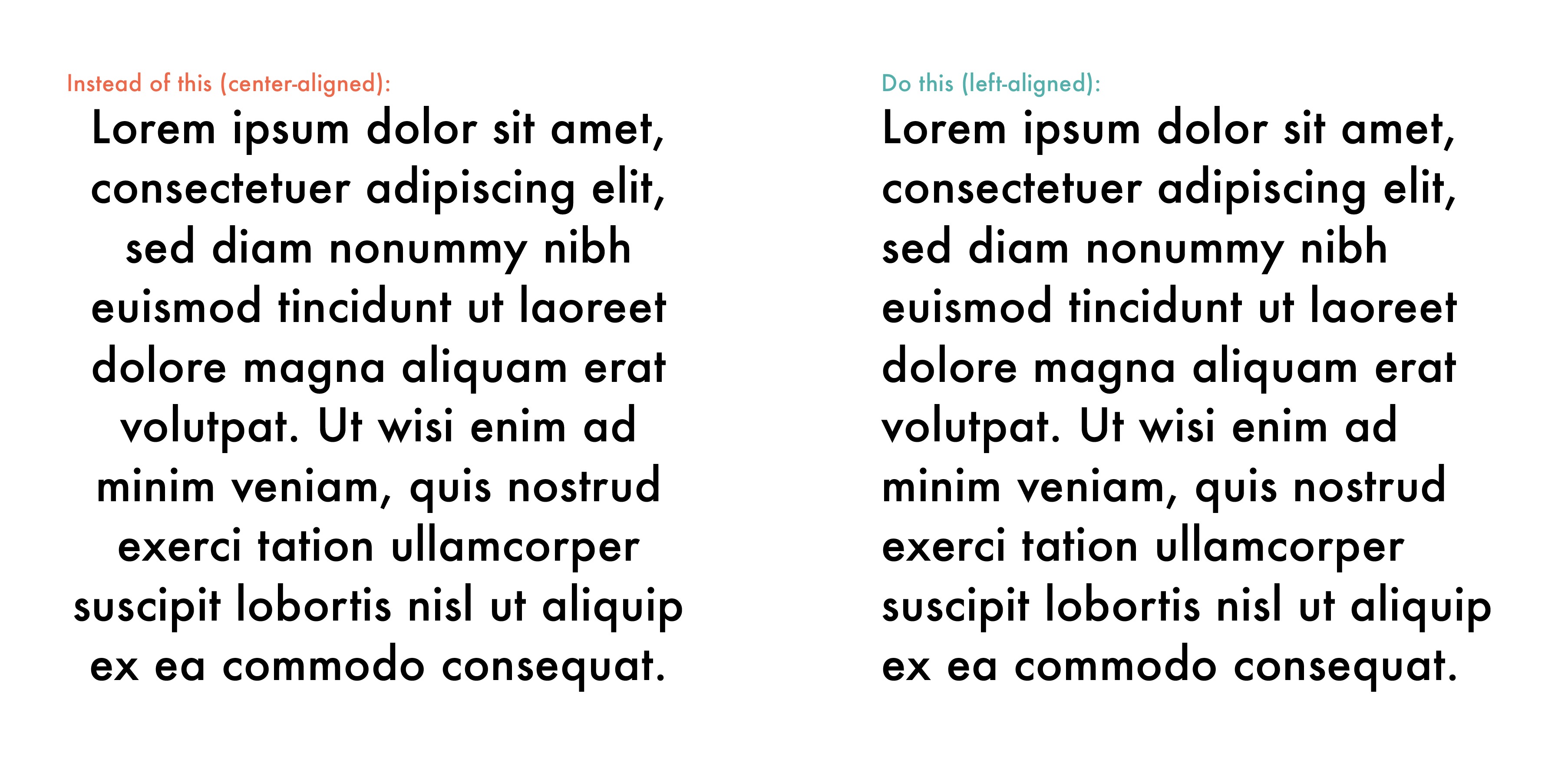
- Don’t center type unless it’s a gravestone or wedding invite. Even then, it’s not completely excusable. Don’t use justified columns, either. Left-aligned type is standard for a reason and is perfectly acceptable.
- Pay careful attention to leading. Leading is the space between lines of text. A good rule is to increase the point size of the type by two or three points to find the ideal leading size. For example, if the font you’re using is eight points, a good leading size would be 10 points or 11 points. Don’t go too wide or else it will look airy and unprofessional. A good rule of thumb from my design school professors: “When in doubt, print it out.”
- The term “leading” comes from strips of lead in different thicknesses that are used to manually set lines of moveable type when printing on a letterpress.
- The term “leading” comes from strips of lead in different thicknesses that are used to manually set lines of moveable type when printing on a letterpress.
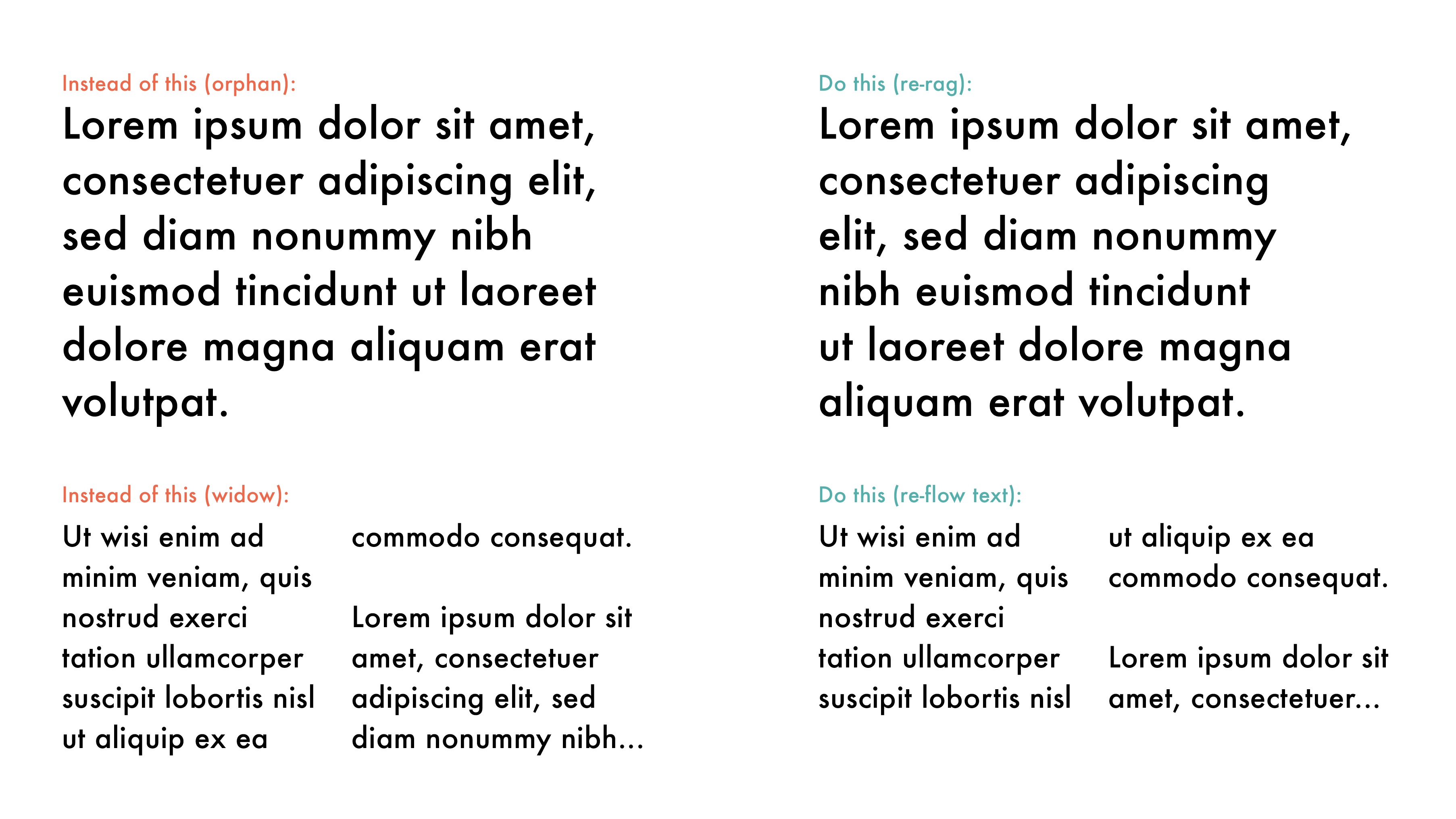
- Avoid widows and orphans when laying out paragraphs of text. This is a standard typography rule. Widows and orphans not only look awkward visually but disrupt the flow of reading and should be avoided.
- Widow: the last line of a paragraph left on its own
- Orphan: the last word of a paragraph left on its own


BONUS TIP: Never stretch a font. Horizontally or vertically, doesn’t matter—don’t ever do it. Typefaces were designed by typographers specifically to retain their proportions without adjustment. This is a quick way to make any work look amateurish and clumsy.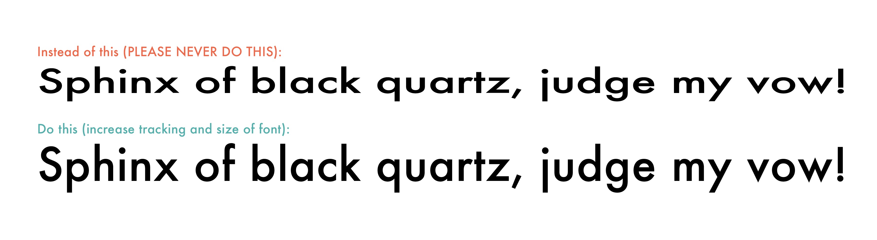


Leave a Reply
You must be logged in to post a comment.