Each year tends to have defining themes and unique looks. Last year we saw the rise of 3-D imagery, collages that combine photos and illustrations, and big typography. We also saw some trends that are still being explored this year, such as gradients, authenticity, and sustainability.
Below, I’ve compiled these and other design trends I expect to see this year, based on research and my opinions. And I discuss how they may make their way into, or continue to be seen in, B2B content. For each, I share examples of the kinds of things we’re helping our clients create and that we anticipate seeing more of throughout the year.
Sustainability and nature
This year is likely to bring a focus on nature and sustainability—in terms of content themes, design motifs, and design formats.
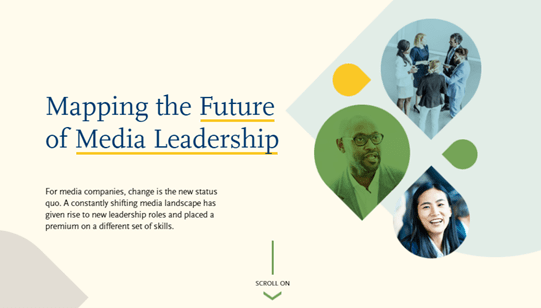
In B2B content, this trend will show up as organic tones, shapes, and colors—for example, simple shapes that evoke nature, such as in this interactive. While the piece is about media leadership, the shapes and colors are reminiscent of water and leaves.
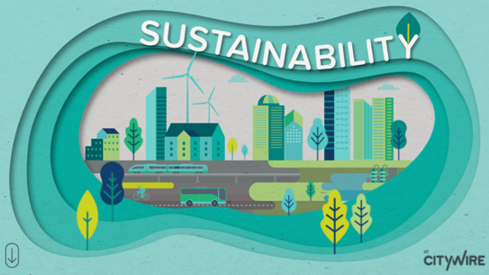
In some ways, the creation of B2B content has naturally evolved to be more sustainable over the past year; we aren’t printing as much because there haven’t been in-person events and meetings where materials would be handed out. This reality presents an opportunity to think differently about online presentations and other formats, which save the trees. This example happens to be about sustainability, but the overall concept and look and feel, and especially the art, create the illusion of being a tangible, physical piece—yet it’s a purely digital interactive.
Retro feel combined with modern design
This trend is less about bringing back the vibrant colors associated with the 1970s than it is harnessing the more simple and muted palettes and designs of the print age. This approach will tap into people’s nostalgia and act as visual comfort food by reviving imagery and typography from previous decades. It is also a recognition that people likely don’t want to see and wouldn’t relate to overly bright and electric designs at this time.
As an example, this interactive about the Seattle Mariners has a beautiful faded, airy background that gives you that retro feel, yet the icons keep it modern.
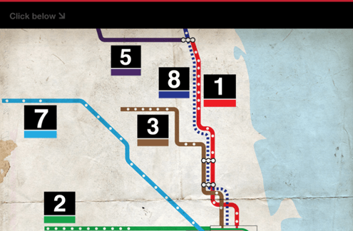
This interactive takes an old map of Chicago’s train system and layers on modern typography and interactivity.
Optimism and playfulness
At the same time, optimistic and playful imagery, if done well, could encourage hope and come as a welcome reprieve from a world in chaos. The key here is balance: pair eccentric illustrations with slightly muted colors, and bold colors with simpler typography.
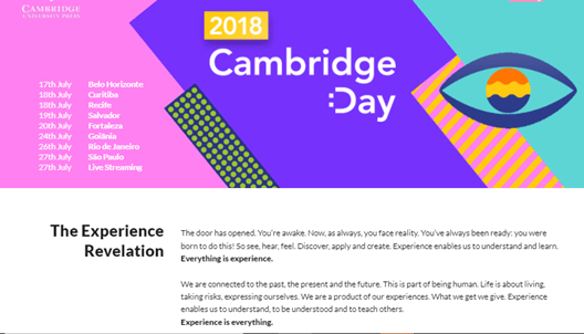
This trend could work particularly well in B2B content because we can use playful illustrations and colors to liven up content, such as in this example:
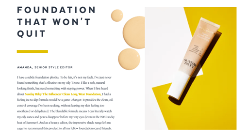
This makeup ad can also provide inspiration for B2B marketers because of its combination of unique, bold shapes and colors paired with photos.
Authentic typography
Authenticity could emerge this year in various ways, including through visuals that reflect the true makeup and diversity of society. But in particular, I expect to see more raw serifs with a lot of character.
Serif fonts are classic, and there is a “character” to all of them. To me, they are like people—each with distinct edges, slabs, or rounded curves. They all give off a different vibe. Using more serif fonts can help companies, including B2B companies, authenticate a design and make it more readable.
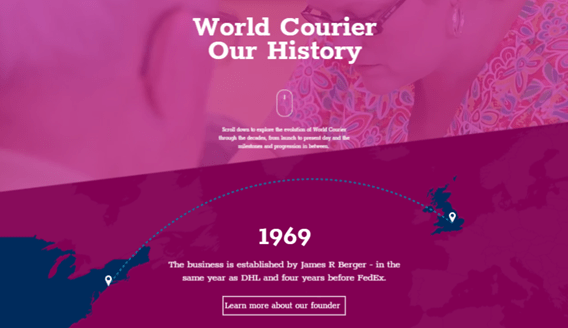
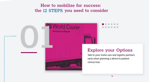
This World Courier interactive is a beautiful design overall, but the font really gives it a unique touch that brings it all together. If it were just a simple sans serif font, the font would get lost in the design, but instead the font stands out.
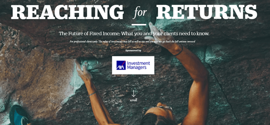
This page uses a beautiful mix of serif fonts. Mixing fonts and sizes this way is also an effective way to add drama and tension.
Gradient and filtered backgrounds
I am not a fan of flat gradients, but adding a filter onto a gradient gives the design an extra texture and also a printed feel.
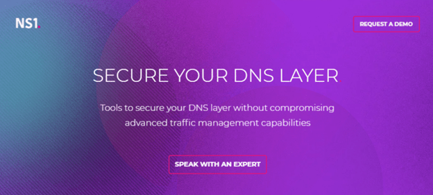
While this trend relates to the retro vibe, it can be applied in various ways—and, depending on how it’s done, it could be animated. Pairing a gradient with geometric shapes and good typography can bring this trend to life. This is also a technique that we can experiment with for certain B2B content—for hero imagery, backgrounds, and content where illustrations or photos are not possible. Here is an example with a beautiful filtered and animated background. The background gradients add a lot to a rather simple page design.
Symbols and icons
This is more of a continuing trend than a new one; icons and symbols have been around since the beginning of man. Symbols have a huge range of applications—they can be used for everything from representing a single animal to evoking an entire company’s values and mission.
Icons are very popular in B2B content and can visually aid text-heavy statistics, diagrams, and abstract concepts. Because they’re so effective, they’re likely to continue to be used until the end of time.
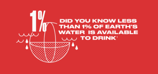
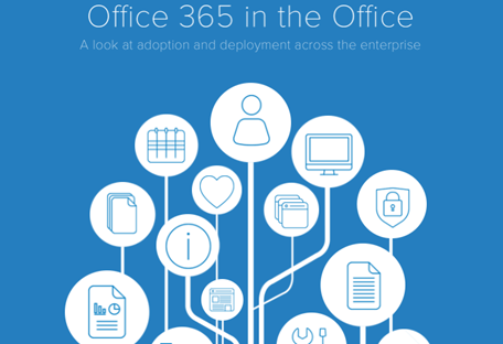
See the examples below. The icons, symbols, and simple illustrations in these Colgate and VICE impact and Office 365 examples elevate the design and add visual appeal to relatively simple concepts.
Fresh healthcare branding
This one is very specific, but it is also super relevant given the worldwide focus on all things health stemming from the COVID-19 pandemic. Medical packaging has essentially been the same for ages, but we’re seeing a push for a brighter palette, vibrant illustrations, and color coding. B2B medical and health content could benefit from a similar rebrand.
This World Courier example has great bold colors and typography, which are not usually seen in healthcare content. This design can also translate to many other industries.
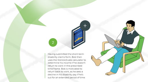
This interactive uses illustrations that are friendly and colorful, and they effectively depict a day in the life of an employee on short-term disability.
***
This year, like every year, content creators have an opportunity to rethink their standard approaches and push the boundaries of accepted design to meet people where they are, reflect the reality of the times, and create more compelling and thoughtful content. I can’t wait to see the results.





Leave a Reply
You must be logged in to post a comment.