
The emergence of new media has brought with it a profusion of job positions and titles no one really understands. I suspect some titles are a string of fungible words preceded by “Global.” I’m sure Malcolm Gibb would agree. His title generator offered me the inspiring choice of “Awesome Data Overlord.” My actual role is data visualization editor—quite a mouthful. And what exactly does it mean? It’s not quite data science; it encompasses but stretches beyond visual design; and, surprisingly, it requires writing talent. How did I arrive at this role that demands constant explaining?
When I was five, my mother would sit us down with crayons and paper, turn on classical music, and invite us to draw the music. In my child’s mind, it made complete sense to me that a beautiful auditory input could transform into a beautiful visual output. I’d never heard of channels or formats back then. If the music spoke to me, I could speak back. I loved to draw.
Then one year in grade school, the teacher challenged us to learn a new vocabulary word each day. We started at the beginning of the alphabet. “Abhor” brought images of a medieval monster to my mind—definitely abhorrent. “Accumulate” sounded like the soft noise clouds must make as they clump on the horizon. I was particularly delighted by the word “adhere.” I felt quite sophisticated rolling that off my tongue while spreading glue on construction-paper cutouts. I discovered I loved words.
Already a voracious reader and a self-declared artist, I met calculus in high school and was stunned at the link between formulas and visual shapes in a graph. Did you know that quadratic equations can describe sections of a cone, thereby visualizing the circle, the ellipse, the parabola, and the hyperbola? Even more remarkable are the patterns made by Chladni figures, generated by particles responding to the vibration of metal plates. Graphs drawn by sound—astounding! Sophie Germain, a French mathematician (an unheard-of role for a woman in the early 19th century), won a prize from the Paris Academy of Sciences for figuring out a differential equation to account for that visual phenomenon.
These references may be too arcane, but certainly you’ve heard of the bell curve—the classic shape of a normal distribution of a variable? Or squaring the circle? The latter is nearly a cliché now, used to describe the challenge of solving an impossible problem. But it originated among ancient practitioners of geometry and only in the 19th century was proven to be impossible. Turns out I love math, as well.
In college, I met color theory and promptly fell in love with Johannes Itten, a Swiss expressionist painter who taught at the renowned Bauhaus school around a century ago. He chose such evocative words to describe the psychological effect of colors. For example, the cool–warm contrast is “the most sonorous,” or a certain composition was “a melancholy dusk of clouded colors.” He drew me in with both his visual and verbal sensitivity. (Christopher Nolan cites Itten as his inspiration for the noir look of The Dark Knight Rises.)
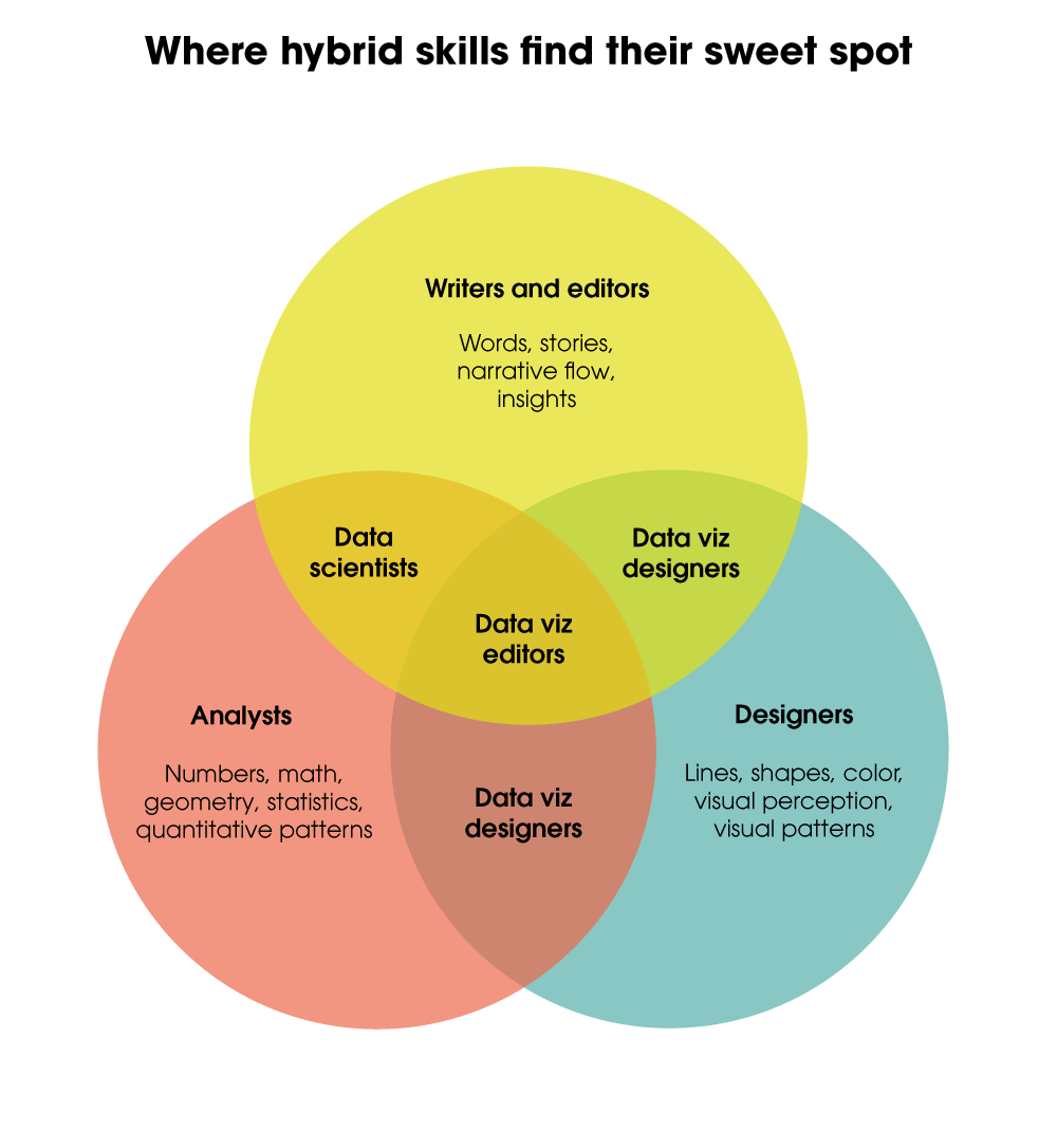
Thus, this data viz editor came about from the confluence of visual imagery, writing, and calculating (with some instrumental background music to keep the creative juices flowing). I understand numbers, data, and statistics; can evaluate the subtle communicative effect of color, proportion, and space; and dig into the specificity of the words that surround any chart, map, or diagram. Together, these elements create good data visualization (exhibit).
Team effort is essential in weaving data and visual elements into a coherent communication. I’m happy to bring my skills to Leff, where I get to collaborate with a crew of talented editors and designers. I’m on board to not only refine existing charts but also develop data stories hidden within complicated charts or a prose explication. I look forward to exploring new perspectives with our clients, creating clear and compelling data visuals that are fully integrated into their content.
Exhibit:


Leave a Reply
You must be logged in to post a comment.