
How do you handle a data-driven story? As with any piece of content, the primary message, story structure, and considerations about audience come into play. But data stories beg for visualization. Choosing the right lenses to parse the data, the best order in which to present charts in support of the prose, and the most effective visual format can make the difference between an average and excellent piece. This blog will highlight examples of great data storytelling, along with my thoughts on what makes them work well.
This post features three articles on diversity and affirmative action in US college admissions. The US Supreme Court recently struck down affirmative action programs for college admissions, raising questions about how the decision will affect institutions’ diversity goals. Drawing on the same research data from Harvard economists, each piece takes a slightly different approach—interactive, chart-heavy, or prose only. And each one offers intriguing data-based insights.
‘For Most College Students, Affirmative Action Was Never Enough’
This New York Times interactive lays out admissions rates at US colleges and universities, all the way from highly selective to effectively wide-open institutions. The long, detailed scroll through admissions data for hundreds of institutions makes a strong visual statement. Together with a column chart showing how relatively few Black and Hispanic students attend schools with an admission rate of 20 percent or less, these two graphics carry the story.
‘Study of Elite College Admissions Data Suggests Being Very Rich Is Its Own Qualification’
This is another piece of great reporting by The New York Times on new research from Harvard economists. The charts are well chosen, culled from a plethora of data within the report, and designed as simple, high-impact graphics. The scrolling animation in the second chart presents a smooth four-part zoom in on income percentiles. Looking at the data through different lenses—test scores, parents’ income, legacy admissions, recruited athletes, and nonacademic ratings—offers a nuanced insight into the state of play.
‘Why You Have to Care About These 12 Colleges’
Reporting on the same Harvard research, The Atlantic offers a highly readable account of the data in prose. There is an art to describing data points in prose; the best prose often includes comparisons that clarify or emphasize the importance of the data points. Concrete descriptions such as “at age 33” and “Goldman Sachs” land the data in a real-world scenario.
All of these pieces exemplify good data reporting. They clearly define who, what, and when for each set of data points. The words accompanying charts and figures help the reader follow the logic of the data reporting. The two chart-heavy pieces move through a number of views on the data that provoke important questions about underlying causes and potential solutions. That delivery of insights is the hallmark of great data reporting.
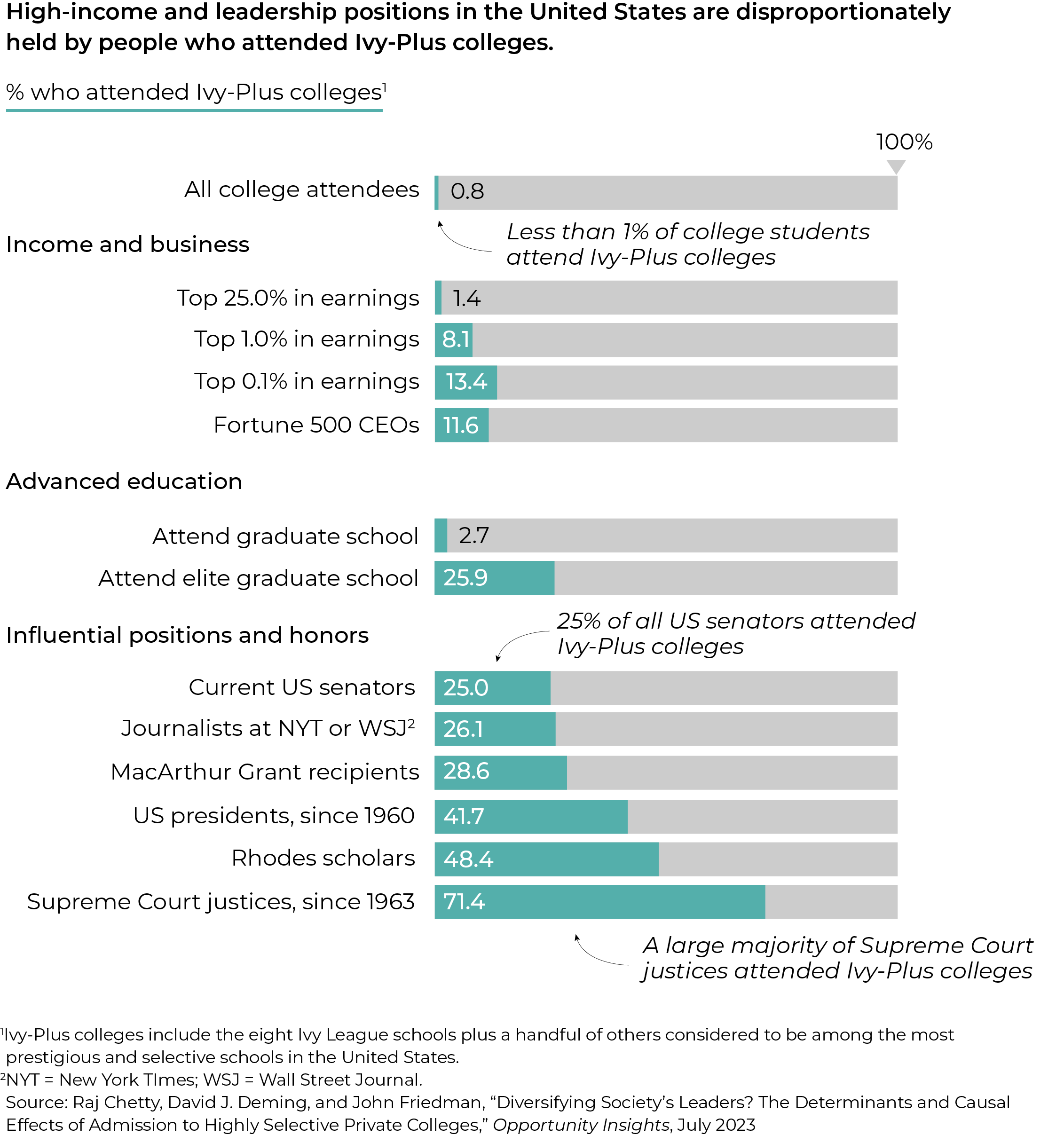
But after studying the original research, I wondered why none of the above included some form of this startling chart. The percentages for earnings and leadership positions indicate a fast track for students at Ivy-Plus colleges. Given the recent concern about the public’s trust in the Supreme Court, the final figure suggests the court is very much an exclusive club.


Leave a Reply
You must be logged in to post a comment.