
How do you handle a data-driven story? As with any piece of content, the primary message, story structure, and considerations about audience come into play. But data stories beg for visualization. Choosing the right lenses to parse the data, the best order in which to present charts in support of the prose, and the most effective visual format can make the difference between an average and excellent piece. This blog will highlight examples of great data storytelling, along with my thoughts on what makes them work well.
This post discusses issues related to environmental, social, and governance (ESG) data and provides examples of visualizations that shift potentially confusing data out of text and tables into more-accessible charts and illustrations.
With the convening of the 28th Conference of the Parties to the United Nations Framework Convention on Climate Change (COP28), held from November 30 to December 12, 2023; the US Securities and Exchange Commission’s (SEC) new mandatory regulation on sustainability reporting; and the ongoing rollout of the EU’s Corporate Sustainability Reporting Directive (CSRD), company leaders are increasingly aware of the need to make—and measure—progress on ESG issues. ESG reporting requires companies to disclose information on an organization’s operations across a broad range of issues, including the climate crisis, DEI (diversity, equity, and inclusion), worker fairness, transparency, stakeholder engagement, and accountability.
The ESG reporting process remains relatively unstructured, with a huge variety in outputs. But it has become a fact of life: two-thirds of respondents to a recent Wall Street Journal survey said their company was disclosing ESG information, up from 56 percent in the prior year. Companies also feel pressure from consumers and investors to be transparent and accountable. Moving beyond spreadsheets and tables, companies will want to draw on well-designed visualizations to share their sustainability stories. Clearly reporting the current state of play and progress against goals will go far in avoiding the appearance of greenwashing.
The remainder of this blog post highlights five visualizations that do a good job of circumventing common issues. In doing so, these visualizations illustrate three important principles for great data storytelling, including that related to ESG: help readers understand the data challenge, simplify complexity, and favor showing over telling.
Help readers understand the data challenge
PwC’s “Building a Sustainable Path to Cleaner ESG data” lays out the challenges US companies may encounter in conforming to SEC rules for climate disclosures. Acknowledging that no one size fits all, the article summarizes potential issues in aggregating data that may come from multiple or unknown sources or that may be subject to human error. Midway through the page is a simple visual guideline describing five steps for ensuring high-quality ESG data. Step-by-step visuals can be helpful when addressing a complex and potentially problematic process. This one provides a high-level structure for leaders who are newly considering their methodology for ESG reporting.
Simplify complexity
One can find a plethora of CSRD timelines online—many containing lengthy, fine-print descriptions dotted with acronyms (EFRAG, ESRS, NFRD). Diving into a lengthy description of the impetus behind the new standards and how they improve on existing regulations is fodder for many an article. But ahead of that dive, readers can benefit from a good visual summary. S&P Global caught my eye for using plain language to explain the CSRD. Pairing the affected categories of companies with the years in which they must comply, the visual is a short and sweet introduction to what is truly a complex rollout.
Show, don’t tell
Organizations will likely reach for tables or spreadsheets to conform with reporting standards. But sharing progress with stakeholders cries out for the support of a good chart. Many corporate ESG reports reach for short data statements (e.g., 30 percent reduction in Scope 1 emissions) in a visual format, bumping up the size of the number for graphic effect. But a little of these goes a long way; too many covering a wide range of contexts encourages a reader to bypass them.
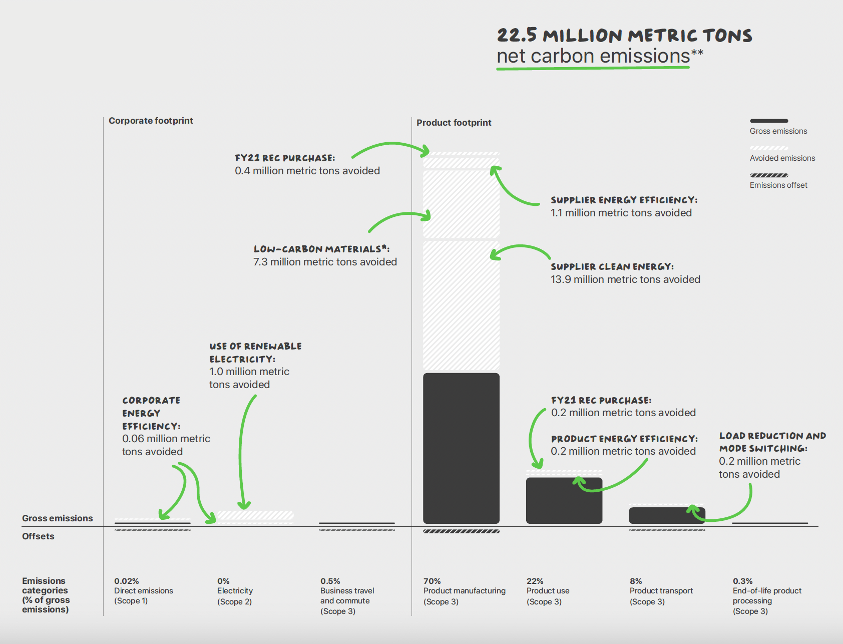
Charting the current status, what’s at play, and what needs to change is a more engaging approach. In Apple’s 2022 Environmental Progress Report, a segmented column chart (page 13) delivers a comprehensive picture of both corporate- and product-related carbon emissions, along with a further elucidation of Scope 1, 2, and 3 emissions (see Figure 1). This kind of information is too often conveyed in lengthy prose. Apple’s chart, in contrast, is comprehensive yet easy to follow.
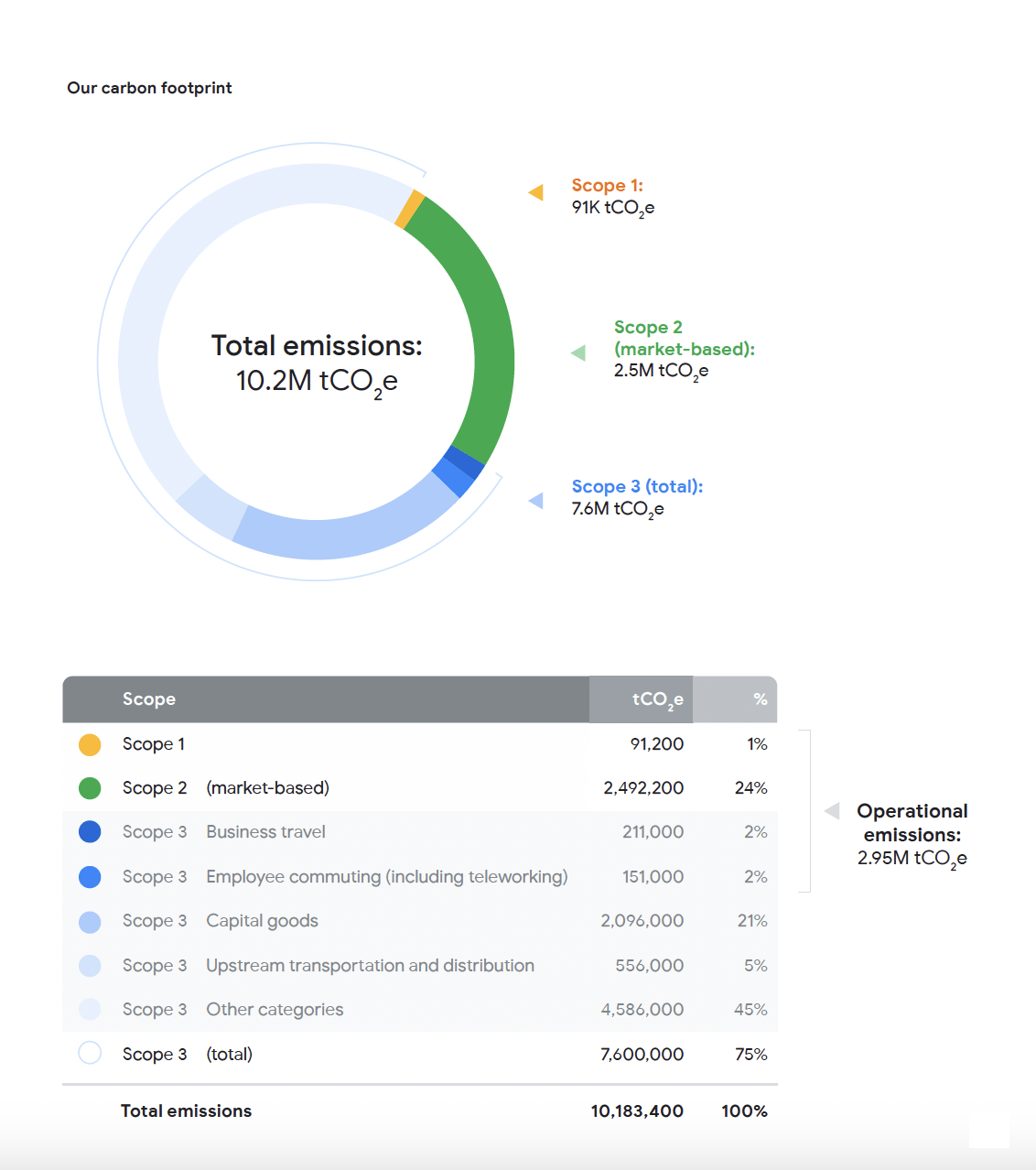
The Google Environmental Report 2023 uses a simple donut chart (page 35) to convey the proportional share of emissions by scope. A table below the chart serves as a legend while listing metric details. This combination allows for a quick visual assessment of emissions per scope, along with a breakout of the organization’s Scope 3 emissions sources (see Figure 2). Relying on the strength of both formats is a smart solution. (Want to understand Scope 1, 2, and 3 better? See Deloitte’s straightforward coverage of what you need to know.)
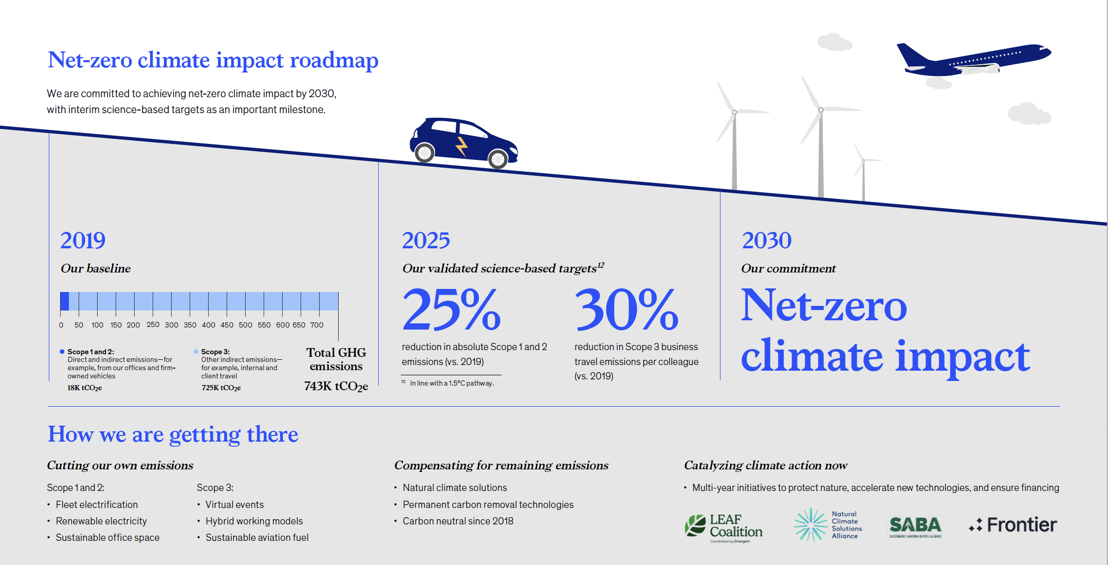
Describing the current status and naming targets builds trust in the company’s commitment to ESG standards. In McKinsey’s 2022 ESG report, in the chapter on sustainability, a full-page infographic (page 11) describes the company’s baseline by scope, the 2025 targets, and how they intend to achieve them (see Figure 3). Again, it’s the simplicity of the visual and the brief, direct statements that make this infographic effective. Unlike multiple data statements sprinkled throughout the report, a well-written and -designed infographic pulls the relevant data together, making the factors at play more apparent. Ideally, as companies continue to track and assess ESG data over the coming years, stakeholders will gain confidence as they see significant progress being made.
In the end, the aim of data visualization within sustainability reporting is the same as in other types of content and thought leadership: when done well, it can ensure that important insights on technical topics don’t get buried in mountains of text.


Leave a Reply
You must be logged in to post a comment.